What Are the Different Types of Maps and Graphs?
What Are Physical Maps?, What Are Political Maps?, What Are Special Purpose Maps?
What are climates like in different countries? Why do people live in certain areas? How can you locate areas or countries around the world? Geographers use globes, maps, charts, and graphs to show different features of the earth. They also use these tools to better understand people and their cultures.
General purpose maps show countries, cities, and continents. They also show rivers, roads, mountains, and oceans. There are two kinds of general purpose maps: physical maps and political maps.
What Are Physical Maps?
Physical maps show important natural features, such as mountains, rivers, and lakes. The natural features that make up the earth's surface are called landforms. A famous landform in China is the Gobi Desert. It is in north China just a few miles west of Beijing. Other landforms are plains and plateaus. A plain is a flat, rolling lowland. A plateau (pla-toh) is also flat, but stands higher than the surrounding area. It rises steeply from the surrounding land.
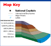
Some physical maps use colors and shading to show elevation. Elevation is how high the land is above sea level. Always look at the map key. It tells you what colors stand for the different elevations. Physical maps make it easier to see the make up of the land.
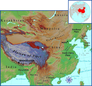 Physical Map of China

China has the largest population in the world. There are over one billion people living there. However, only fifteen percent of the land is good for farming.
What Are Political Maps?
Political maps show how people have divided up the earth's surface. These maps show state and national boundaries, capitals, and large cities. Political maps use different colors to show different countries. A capital city is usually marked with a star or a star inside a circle. Always read the map title to learn what the map is about. Then look for grid marks that show latitude (horizontal) and longitude (vertical) lines. These lines show the location of the map area on the earth. Find the map key. The key tells you the meaning of the symbols or colors used on the map.
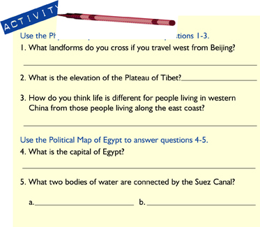
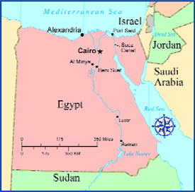 Political Map of Egypt
![]()
There are two main general purpose maps. They are physical maps and political maps. Political maps show how people divide land into countries, cities, or states. Physical maps show landforms and elevations.

Africa has 15% of the world's land. But Africa has only 12% of the world's population. Landforms, such as deserts, and weather conditions limit where people can live.
What Are Special Purpose Maps?
Special purpose maps show specific kinds of information. They can show climates, different languages, how land is used, or populations in a country. Special purpose maps show you how things are distributed, or spread out.
Population density is the number of people who live in a particular area. The population, the number of people, is not spread evenly across a country or a continent. Some areas have more people. Some areas have fewer people. Population density maps show you that information.
The map below shows where people live in Africa. Most people live in areas with water and land to grow crops. They also need land and water routes for travel and trade. Different colors on the map show how many people live in different areas.
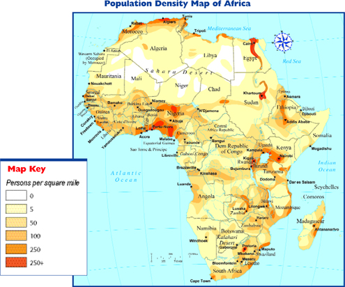 Population Density Map of Africa
Distribution maps show how things are spread out across an area. For example, the map of Africa shows you where people live across Africa. Other distribution maps can show where forests are located throughout the world. Or they may show where rice is grown in Southeast Asia.
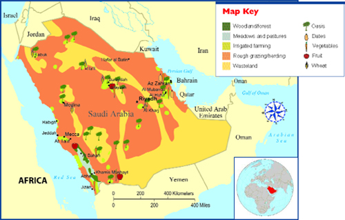 Land Use Map of Saudi Arabia
Courtesy of the University of Texas Libraries, The University of Texas at Austin.
Above is a map showing how the land is used in Saudi Arabia. Because Saudi Arabia is very dry, water is important to the people who live there. Look at the map key. This map uses many symbols. They are easy to understand. These symbols look like the features they stand

Only one percent of the land in Saudi Arabia is good for farming. The climate is very dry, and most of the land is desert.
![]()
Special purpose maps are important tools to help you understand the five themes of geography. They tell you about location, place, how people use the resources where they live, movement, and the region.
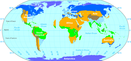
How Does Climate Affect How People Live?
Mild Climates
- • This climate has mild, rainy winters with cool to warm summers.
- •Some regions near the Mediterranean Sea have hot, dry summers.
- • Shrubs and short trees grow in this climate. Some of the trees are evergreens, but others lose their leaves in the dry season.
Tropical Climates
- • Tropical areas are usually hot and wet all year.
- • Some tropical areas may have a dry season.
- • Thick forests with millions of plants grow here because of the warm temperatures and rain.
- • Tropical rain forest receives up to 100 inches of rain a year.
Dry Climates
- • True deserts are very dry and hot all year. They are usually hot during the day and very cold at night.
- • Only a few plants called cacti can live I in desert climates. Their roots are near the top of the soil to collect rainwater.
- • Deserts receive less than 10 inches of rain a year.
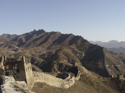
Climate is the average weather conditions of a region over a long period of time. A climate map is a type of special purpose map. It shows you the different climates in the world. The latitude, elevation (height from sea level), and distance from the ocean help determine a region's climate. Climate affects where people can live. It also affects what they can grow. People cannot live where there is no water or soil to grow food.
There are six main climate zones in the world: tropical, dry, mild, continental, polar, and highland.
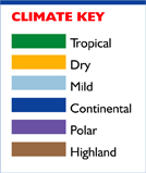
Polar Climates
- • Polar regions are very cold and dry.
- • Tundra regions have short cool summers. A few grasses and low bushes grow here. There are no trees. They cannot set up roots in the frozen soil.
- • Lichens (flat, mosslike growths) grow on rocks. They are the only plants that can live in the ice cap regions.
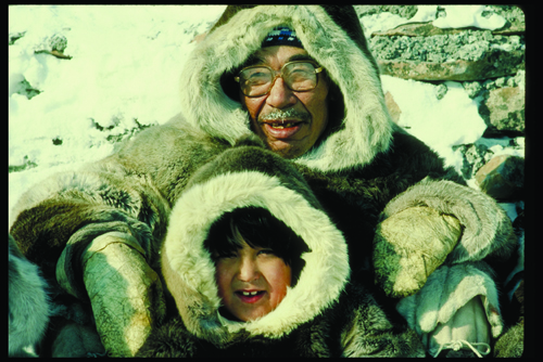
Continental Climates
- • This area usually has wet, hot summers and cold, snowy winters.
- • Summers are very short with long days of sunlight. Winters are long.
- • Evergreens and trees that lose their leaves in the fall, called deciduous (di-sij-oo-uhss), grow in forests.
- • In some regions, there are large areas of grasslands.
Highland Climates
- • This climate has mild, rainy winters with cool to warm summers.
- • Some regions near the Mediterranean have hot, dry summers.
- • Shrubs and short trees grow in this climate. Some of the trees are evergreens, but others lose their leaves in the dry season.
![]()
By studying climate maps, you can discover how weather conditions affect where people live and how people live throughout the world.

Contour maps have many uses. They help to plan the best route for a hike or a bike ride. They can also point out the best place to build a school or an airport.
What Is a Contour Map?
Imagine that you are going to take a hike in a forest. You have a map that shows the trail. Will the hike be difficult? Will you be walking up hills? To answer these questions, you need to study a contour map.
A contour map is a kind of physical map. It shows elevations (height of land above sea level). It uses lines to outline the shape, or contour, of the land. Each contour line connects all locations that have the same elevation.
If you walked along one contour line, you would always be at the same elevation. Most contour lines are marked with the elevation. When the contour lines are close together, the land rises steeply. When the lines are far apart, the land rises very gradually. You can also see the shape of the land.
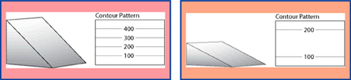 Diagram 1 A steep slope has contour lines that are close together.
Diagram 2 A gentle slope has contour lines that are far apart.
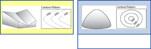 Diagram 3 A valley has contours that are V-shaped. The arrow part of the V points up the valley.
Diagram 4 A round hill has circular contours with the highest one at the center.
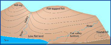 Diagram of a Contour Map
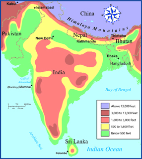
Contour Map of India
India is a huge country with many different landscapes. Some maps use colors to show elevation. Study the map key to understand the different elevations and regions of the country.
![]()
Contour lines show you the shape and the elevation of the land. A contour map helps to explain what a region looks like and how people use the land.
How Do Graphs Organize Information?
A graph presents information in a picture. It is a way of summarizing information. It shows the connection between numbers and amounts. The most common graphs use bars, lines, circles, or pictures to show information.
To understand a graph, first read the title. It tells you the main idea. Next, read the labels on the left side and the bottom of the graph. Some graphs have keys. They explain symbols or colors used in the graphs. Finally, write a summary of the graph to help you understand the information.
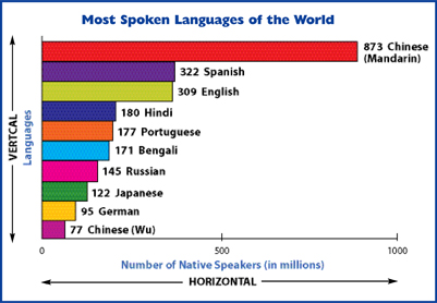
A bar graph uses columns to show information. It has two labels. One label is next to a scale of numbers that tell you how much or how many. The other label tells you what the graph is about. Bar graphs use numbers and bars to compare two or more things. They can be either horizontal (left to right) or vertical (top to bottom). The graph above shows the most spoken languages of the world.
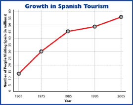
Line graphs, like bar graphs, show the connection between two things. These graphs often show trends, or how things are changing. To understand line graphs, read the title. It tells you what the graph is about. Next, read each label. In this line graph, the label along the left side tells you the number of tourists, or visitors, to Spain. The label along the bottom tells you the years covered by the graph. Notice that the data shown on the graph covers forty years. The data was collected every ten years.
 Source: Spanish Ministry of Industry, Tourism, and Commerce
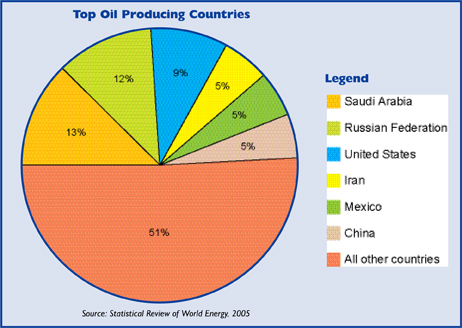
Circle graphs are also called pie graphs because they look like a pie. This kind of graph shows you how a whole is divided into parts. Each slice of the pie is written as a percentage. The numbers in the circle graph add up to the whole, or 100%. Study the key, or legend. It tells you what the colors stand for. In this circle graph, each country is shown in a different color.
![]()
Graphs are pictures used to organize information. They show the connection between numbers and amounts. Graphs can be made up of bars, lines, pictures, or pieces of a pie. Graphs help you to see and understand information.
How Do Diagrams Organize Information?
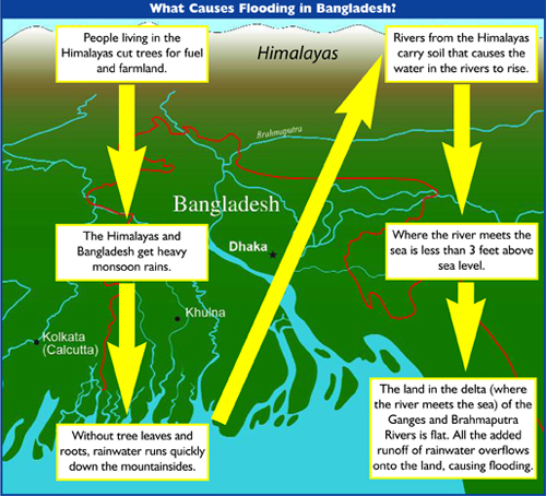
A diagram is a drawing or plan that shows you information. It helps you see the causes of a problem or how something works. A diagram can also show how things are put together. Like graphs, diagrams quickly and clearly present information. Some diagrams include a legend. The legend shows what the symbols in the drawing mean.
What Do Climographs Tell Us?
A climograph is a special graph. It combines a bar graph and a line graph. Climographs show the average monthly temperature and the average precipitation (pri-sip-uh-tay-shuhn) for a place. Precipitation is water falling from the sky in the form of rain, sleet, hail, or snow.
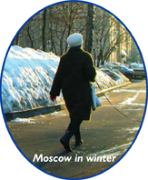
This graph is a useful tool for studying the world's climate. Climographs have 12 columns, one for each month. There is a scale along the left side used to measure rainfall. The scale along the right side measures temperature. Rainfall is shown as a bar. Temperature is shown as a line. The climograph shows the average monthly rainfall and temperature for Moscow, Russia.
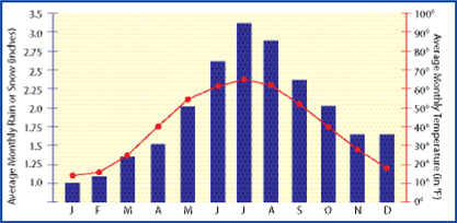 Climograph: Moscow, Russia
![]()
When you are given many facts, it is often difficult to remember all the information and to organize it. Like graphs, diagrams and special graphs help you see many facts clearly and quickly.
Additional topics
- Review
- How Do I Use Globes and Maps? - Globes, How Do I Read Latitude and Longitude?, Maps, What Are the Parts of a Map?
- Other Free Encyclopedias
History Reference: Ancient History & World HistoryThe Eastern Hemisphere - Geography, Globes, Maps and Graphs